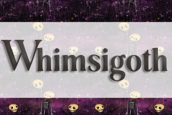
Whimsigoth: A Display Font That Adds Personality Without Sacrificing Clarity
Last week, I was finalizing the hero section for a new creative coaching website—a clean, intimate space built around handwritten journaling, mindful design, and small-batch digital courses. The client loved the mood boards: muted lavender tones, soft grain textures, and intentional whitespace. But the headline font? It felt flat. Sans serifs were too neutral; classic serifs too formal. That’s when I dropped Whimsigoth into the Figma prototype—and everything clicked.
Whimsigoth is a display font with quiet confidence. It’s not aggressively gothic, nor is it purely whimsical—it lives in that thoughtful middle ground: slightly tapered terminals, subtle ink-trail flourishes, gentle contrast between thick and thin strokes, and just enough irregularity to feel human-made without tipping into illegibility. It reads as both nostalgic and contemporary—like a vintage zine cover reimagined for 2024.
I tested it first in the hero banner, set at 64px on desktop and scaled responsively down to 42px on mobile. On light backgrounds, it held presence without glare. Over a softly blurred image overlay (a watercolor texture at 15% opacity), it remained legible thanks to its generous x-height and open counters. No letter collisions. No awkward kerning traps in common word pairs like “your” or “mind.” That’s rare for a decorative display font—and critical when your headline is the first thing users see.
Where Whimsigoth shines most is in short, high-impact roles: hero titles, section headers (“What You’ll Create,” “Join the Circle”), CTA buttons (“Start Your Journey,” “Download the Guide”), and branded graphic elements like course module badges or newsletter banners. It’s not built for body copy—and shouldn’t be. Its charm comes from restraint. Using it for paragraphs would overwhelm; using it for a single, well-placed headline adds rhythm, warmth, and distinction.
In practice, I paired Whimsigoth with Inter—a highly readable, variable sans serif—for all body text, navigation, and form labels. The contrast worked beautifully: Whimsigoth brought voice and character; Inter delivered clarity and speed. For a more editorial spin—say, on a blog redesign or digital brand kit—I’ve also paired it successfully with a warm, low-contrast serif like IBM Plex Serif, letting Whimsigoth anchor headlines while the serif handles longer quotes and bylines with grace.
Readability checks matter—especially on mobile. I ran quick tests across iOS and Android devices: Whimsigoth stayed crisp at 36px and above on touch targets. Below that, even in bold weight, fine details began to soften. So I avoided using it in small buttons (<44px tall) or footer links. Instead, I reserved it for top-of-page impact—where users are already oriented and scanning intentionally.
It also performed well across background treatments. On dark mode (deep charcoal with off-white text), Whimsigoth’s moderate stroke contrast preserved definition without harsh edges. Over subtle gradients or duotone photography, its slight irregularity added texture—not noise. And because it’s a well-hinted webfont (WOFF2 included), load time stayed minimal—even with custom subsets for English + basic punctuation.
Licensing was straightforward: commercial use is covered, including client websites, SaaS dashboards, and digital product templates. No hidden restrictions for e-commerce banners or email headers. I double-checked multilingual support—while Whimsigoth covers Latin Extended-A (so accented characters like é, ñ, ü render cleanly), it doesn’t include Cyrillic or Greek. That’s fine for most boutique brands and English-first creators—but worth noting if your audience spans broader language sets.
One unexpected win? Print-ready consistency. When the client later exported social media graphics and a PDF brand guide, Whimsigoth rendered identically across platforms—no font substitution, no fallback jank. That reliability matters when your font is part of the brand’s visual signature, not just decoration.
I’ve since used Whimsigoth across several real projects: a portfolio site for a ceramicist (paired with Manrope for clean captions), a limited-edition digital sticker shop (where it anchored product banners and collection headers), and a campaign landing page for a mindfulness audio series (used only in the headline and episode title cards). In each case, it elevated tone without demanding attention—supporting the message instead of competing with it.
That balance—personality with purpose—is why Whimsigoth fits so naturally into modern web design workflows. It’s not a “fun” font you use once and forget. It’s a considered choice: one that strengthens visual hierarchy, invites emotional resonance, and quietly signals care in craft. You don’t need to overhaul your entire typography system to benefit from it. Start small—swap your hero headline, test two weights, check it on a real device—and see how much warmth a single, well-chosen display font can bring to your next layout.
If you’re selecting fonts for a boutique online store, coaching site, portfolio, course sales page, or any digital experience where voice and authenticity matter, Whimsigoth earns its place—not as an accent, but as an intentional part of your brand’s visual language.